
TL;DR: I explored what a lock screen could do if it gave people a reason to look twice. After comparing four widget ideas, I chose a live event widget that follows a match, a tournament, or a breaking story as a timeline of moments. I called it PulseWidget, because it’s built for the quick pulse check people do dozens of times a day. Then I took the Figma designs into a working prototype in about a day. The match in it is fictional, and you can play with it yourself.
Think about how you use your phone. Research on lock-screen behavior suggests people check it somewhere between 40 and 85 times a day, and a typical lock-screen check lasts about three seconds.
It’s a pulse check: a quick look to see whether anything needs you. The lock screen is the most-seen screen on the phone, yet most of it is still a wallpaper and a list of notifications.
What if the lock screen gave you a reason to look twice?
Starting with the question, not the pixels
Before designing anything, I did a short research round to decide which widget deserved to be built first. I compared four candidates against the same criteria: how much value each gives in a quick check, how strong the reason is to come back, how well it fits a revenue model, and how hard it is to build.
Weather is useful but gives little reason to return. Games need more attention than a three-second look allows. Headlines are quick to read but fade fast. A live event was the only one that scored high on value, reason to come back, and revenue fit together. It also costs the most to build, because of live data and clip rights. I labeled this my own assessment, not measured data.

Part of the work was writing down my assumptions, along with what I’d do if each one turned out wrong. The point wasn’t to be right. It was to make the thinking visible.
The idea: one widget that adapts
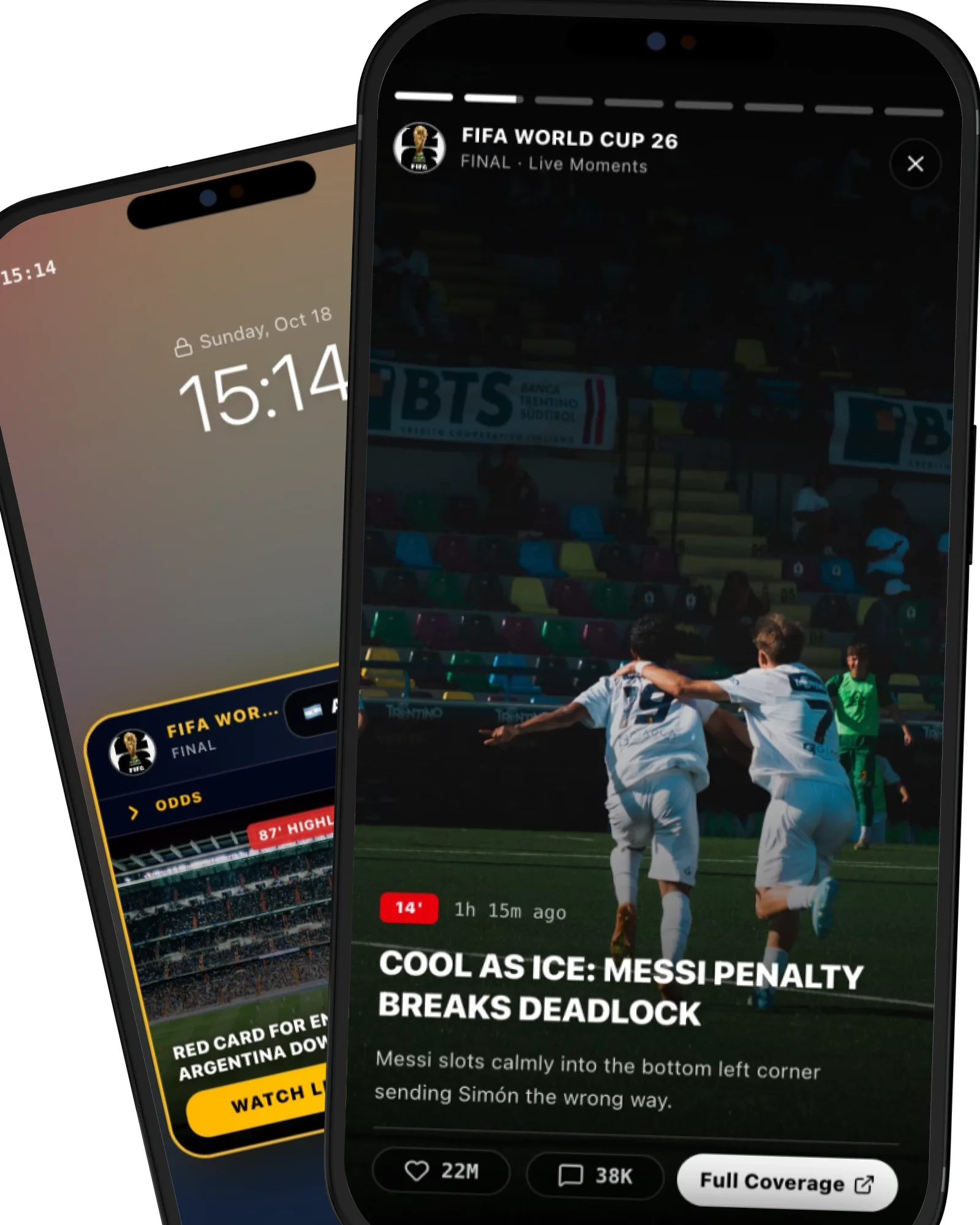
I kept the lock screen calm: one widget, placed above the system’s gesture zone. That single slot changes content and layout depending on the moment: a news carousel on an ordinary morning, a live ticker during a match.


The structure stays constant: safe zones, information hierarchy, contrast and gesture rules. What flexes is the skin, such as brand accents, badges and ticker styles. Users get a predictable widget, and each partner can still make it their own.
The flow: a quick check, then one level deeper
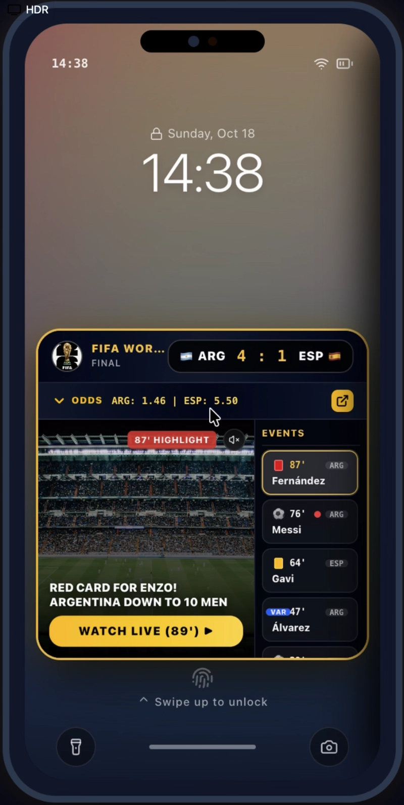
The live event widget works in four states:
- Watch: a looping clip, the score, and a scrolling feed of events.
- Read: tap an event for a bigger image and longer text. Tap again to revert.
- Check odds: tap the score to reveal the odds. Tap away to revert.
- Immerse: tap the call to action for a full-screen story view, still on the lock screen. Swipe down to close, like Instagram stories.

Anything deeper than a story, such as a full article or a betting page, needs the phone to unlock and opens in the browser. I like that boundary: personal data and transactions stay behind the phone’s own authentication.
I also designed for failure, because a widget on a lock screen can’t afford to feel broken. When the network drops, the last update stays, marked with its time. When a video fails, a still image takes over. When no sponsor exists, the widget uses neutral styling.

A working assumption, not a rule
I started with sports, but the real model isn’t sports. It’s moments on a timeline. A match has a pulse minute by minute. A tournament has one across days and weeks. A breaking story has one too: the events that led here, expert analysis, and what might come next.
That’s why the prototype includes three example event types: a fictional World Cup final, a Super Bowl example, and a news story.
A news story needs a different tone from a match. Urgency that suits a goal shouldn’t feel like entertainment when the subject is serious. So the news version uses a bold color palette, has no odds, and its call to action is “Join the live coverage”.

How I’d know it works
The two metrics I’d start with are repeat-check rate (how often people come back to look, per live event) and tap-through rate (how often they go deeper). I’d also be strict about what counts as an impression: a widget on screen long enough to be seen, not just a screen-on event.
Before launch, I’d test whether people can read the screen in three seconds, run usability tests on a real phone, A/B test how much branding the widget can carry before usability drops, and then run a closed beta. Pre-launch tests can show people understand it. Only a beta shows whether they come back.
From Figma to a playable prototype, in a day
This is the part I enjoyed most.
I took the Figma designs into Google Antigravity and built them into a working prototype, with the terminal, GitHub and Vercel doing the rest. A few years ago a design handoff meant waiting. This time I watched the thing take shape in moments: change something, see it live, change it again.
It felt like sculpting. First the rough block, then the shape, then the many small passes until the piece feels solid. The terminal being in the mix made it more fun, not less, because every step gave quick feedback.
What changed my workflow most was how I gave feedback. Writing notes helped, but the best method for me was taking screenshots and drawing my own note bubbles directly on them, tied to a specific element or moment in the journey. Sometimes it’s simply easier to show a tweak than to describe it. That’s what worked for me. Everyone has their own way of expressing what they need, and part of the chiselling is finding yours.

I used AI the way I use any tool: its output is input to judge, not an answer to accept. The design decisions, and the final call on each iteration, stayed mine.
Try PulseWidget
The match, the scores and all the events are fictional. This is how I’d like the World Cup to end.
Video walkthrough
What I would explore next
I’d want to find out whether people really understand the widget in a real three-second check, and how much partner branding it can carry before usability drops. I’d also like to see how the news mode feels with real users, especially on heavy topics.
Closing thought
The lock screen is the most-seen screen on the phone, yet it’s mostly passive. PulseWidget asks a simple question: what happens when it follows the moments that matter to you, calmly, and only goes deeper when you ask?
■ ■ ■ ■
WANT TO JOIN THE CONVERSATION?
CHIME IN ON LINKEDIN →
---
Sources:
It’s Like Being Gone For A Second (UAL Research)
Smartphone use in a large US adult population (PMC / NIH)
Beyond the Buzz: notification-disabling study (Taylor & Francis)
Happy to share the full research behind this project. Just reach out.