design system

Elevating Nexxen’s enterprise experience with a modern, scalable design system.
(Client)
Nexxen
(Year)
2024-2025
(Services)
Product Design
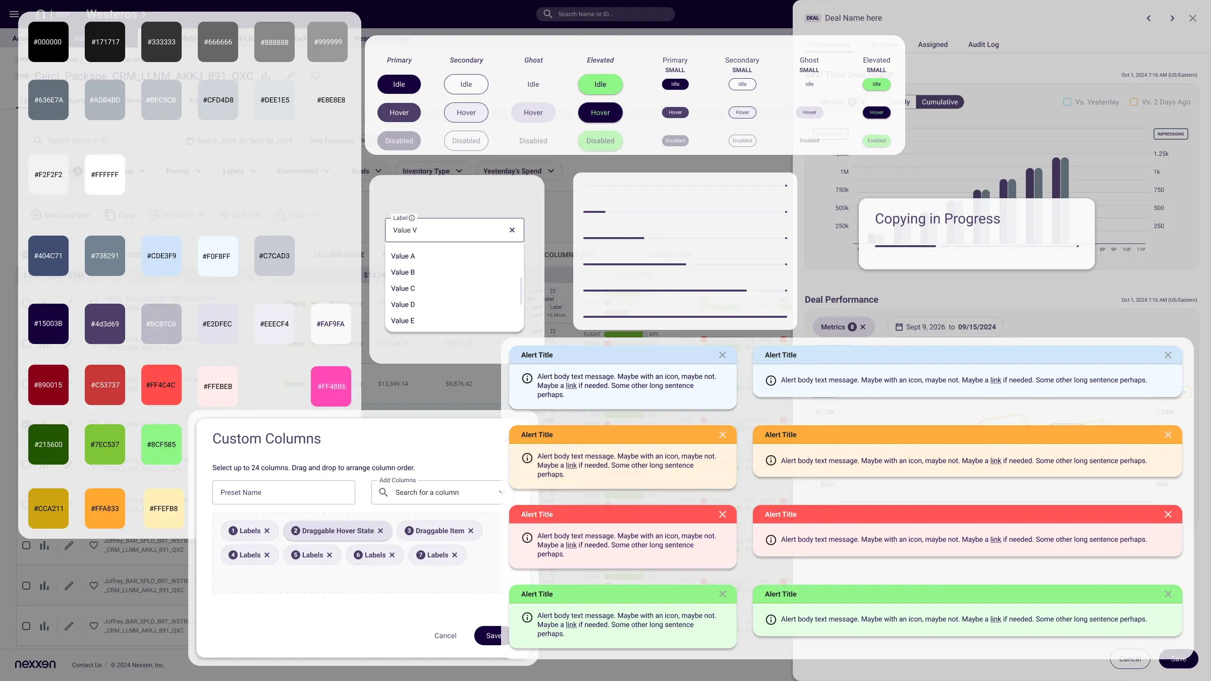
Dashboard showing color swatches, button states, alerts in various colors, and custom column selection interface.

Nexxen

Design System

A unified visual language and component library for a demand-side advertising platform, built as part of a company-wide platform uplift I led as Head of Design.

THE PROBLEM

Nexxen's product spanned multiple sub-products — campaign, deals, reporting and targeting tools — each built independently over time. UI and UX patterns had drifted apart screen to screen, slowing design and development and making the product feel cluttered and inconsistent to clients.

MY ROLE

As Head of Design, I led a team of 4 designers through an audit of every product surface, defined the foundational tokens and component set, and drove adoption across engineering as part of a broader platform uplift initiative.

252

4

Faster

component families unified across the platform

designers led through the system build

screen design once the system was live — clients reported the product felt clearer, less cluttered

01 · FOUNDATIONS

Color

A cool, desaturated navy-purple brand against near-white surfaces. Color is reserved for brand chrome and status — not decoration — which keeps dense, data-heavy screens legible.

NEUTRALS

INFO BLUE

BRAND PURPLE

ERROR & ACCENT

SUCCESS GREEN

WARNING AMBER

02 · TYPE

Roboto, one voice

Roboto is the sole typeface across the product. 10–12px dominate the scale, reflecting how densely the tables and forms are packed.

Aa 32px Bold
Aa 22px SemiBold
Aa 16px Medium
Aa 12px Regular — table default
Aa 10px Regular — dense metadata
03 · SPACING & ICONS

A compact system

A small, table-driven spacing scale based on X8 rule

4
8
12
16
24
32

SELECTED COMPONENTS

CORE · 88
Buttons, fields, chips, badges, tables, nav, breadcrumbs, tooltips, alerts
eXTENDed · 120
Custom columns, presets, bid exclusions, deals flyouts, charts
ICONS · 39 Fam
Material Design 2, 5 styles each, 190+ marks
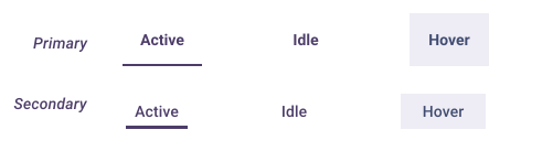
TABS · PRIMARY & SECONDARY
tabs ui design navigation
BREADCRUMBS
breadcrumb example
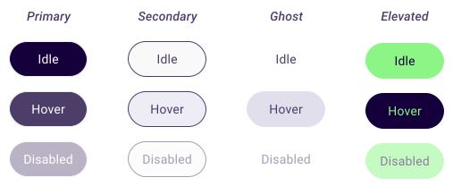
CTA BUTTON · STYLES & STATES
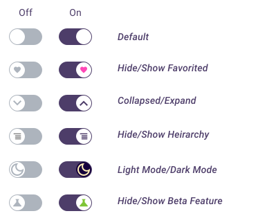
TOGGLEs
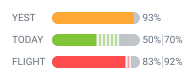
DATA TABLES · VALUE INDICATOR PILLS
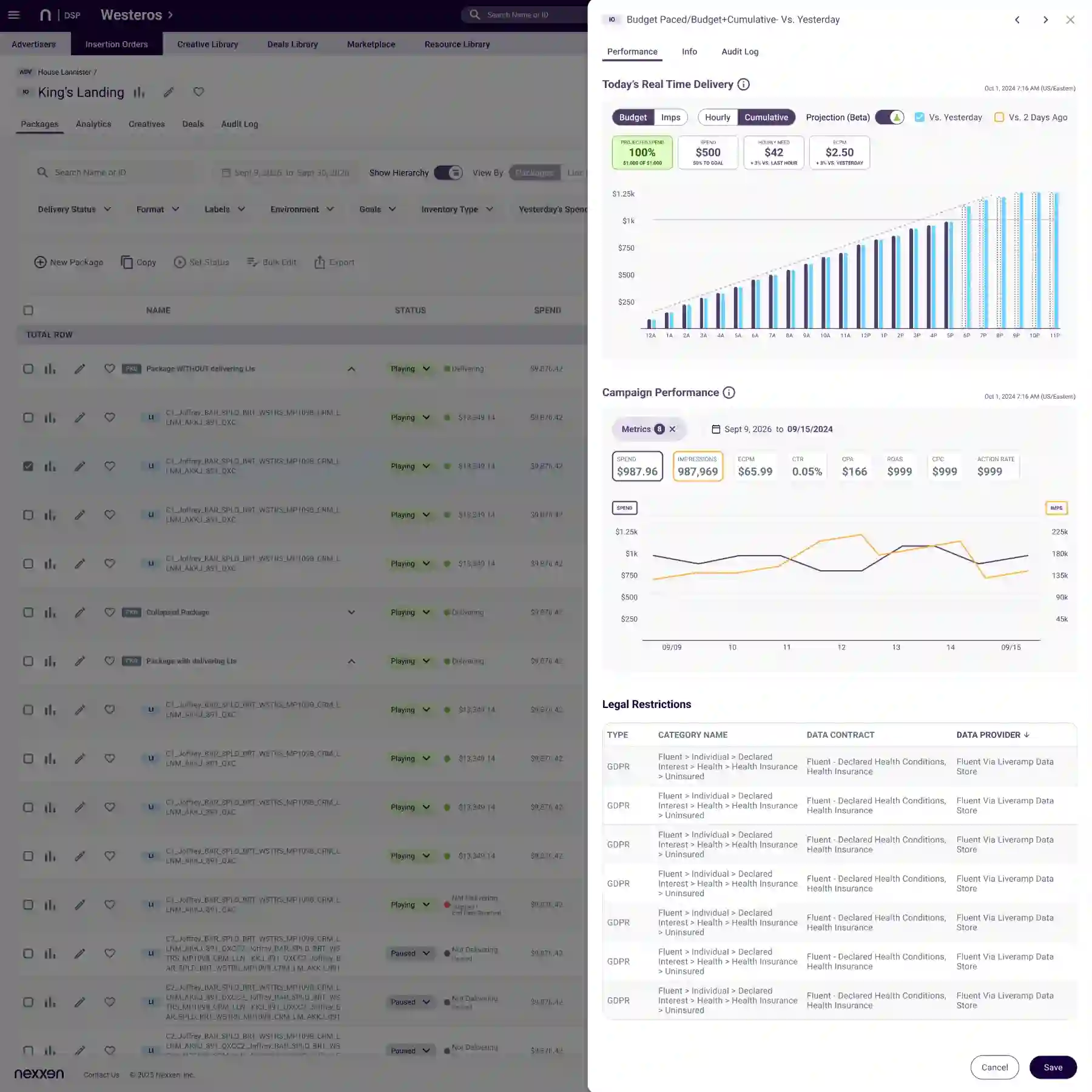
Solid color represents the actual value recorded for each segment, while the candy-cane fill represents the projected value. This visual distinction allows users to compare current performance with expected outcomes at a glance. Both treatments use colors from the defined segment palette in the design system, maintaining consistency, recognition, and a clear visual relationship between the two data states.
DATA TABLE · AD FORMAT ICONS
I created a cohesive set of ad-format icons for Nexxen’s design system, designed to make rich data tables easier to scan and understand. Each icon provides a quick visual cue for identifying different advertising formats, improving recognition and reducing the cognitive effort required to interpret dense campaign data.
test
lottie animations in adtech
I created a set of 12 lightweight Lottie animations for Nexxen’s AdTech platform, delivered as reusable JSON assets. The motion system adds clear, purposeful feedback across the product while keeping implementation fast, consistent, and performance-friendly.

Hover over each animation to preview its idle and hover states.

Account

Logout

Integration

Tag

Play

Monetization

Search

Bars

Pulse

Ad-Break

Sliders

Gear